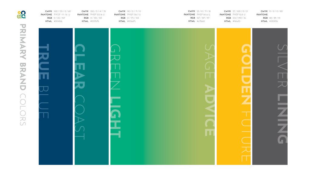
I was recruited by the then Association for Strategy Professionals (ASP), as a design vendor for their re-branding project. With an organizational focus on standardization, education, and support for the strategy community, the goal for the new organizational name along with new icon and branding my goal for the newly IASP was to strike a balance between an air of professional thought leadership, a welcoming atmosphere, and platform accessibility throughout its individual chapters.
With an expanded budget for the project, I was really able to flex by agency level skills and showcase my learned process from 15+ years as a Senior Designer and Art Director. I wrote a formal proposal outlining our steps for the rebranding which included:
- A Branding Questionnaire to hone in on a visual direction
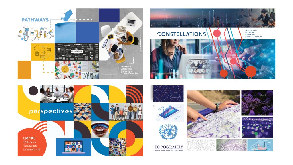
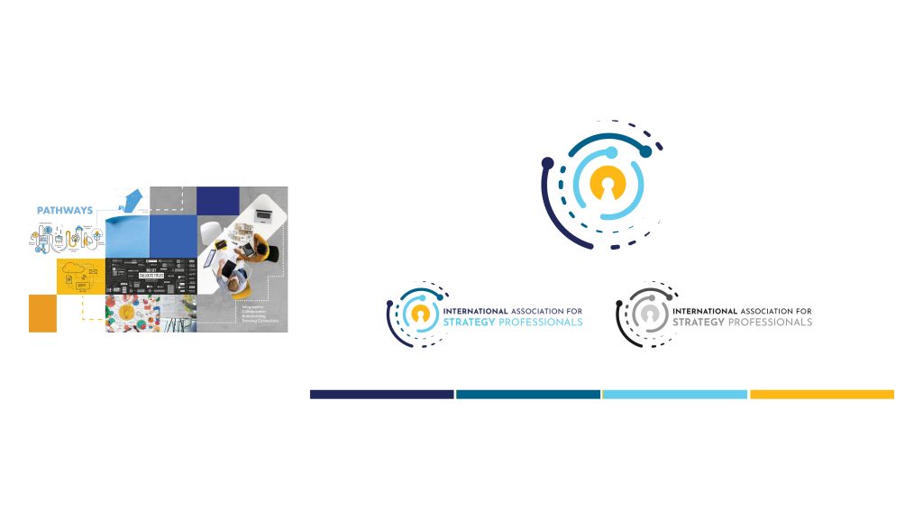
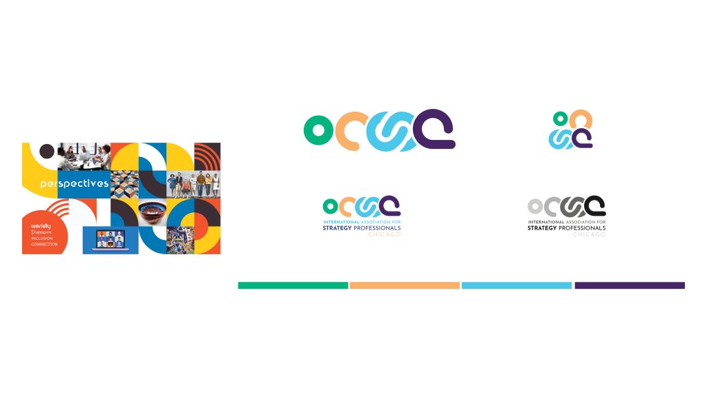
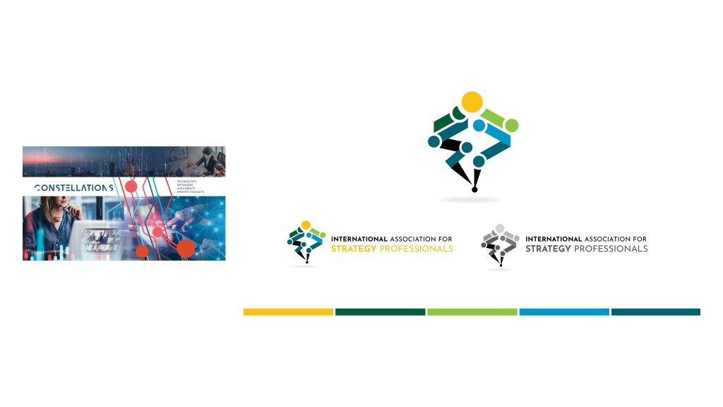
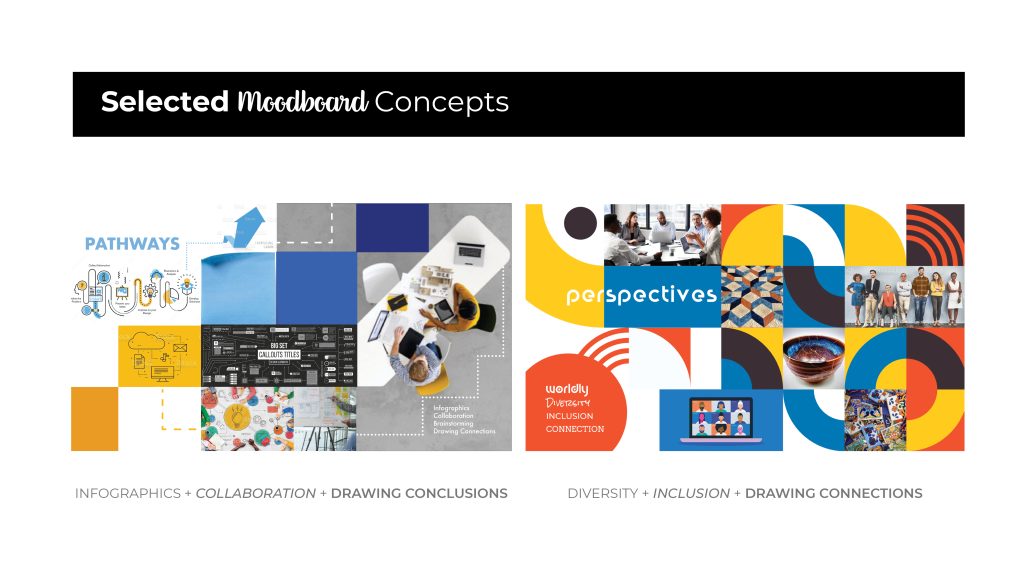
- Minimum of three moodboard options to help hone design direction for board review
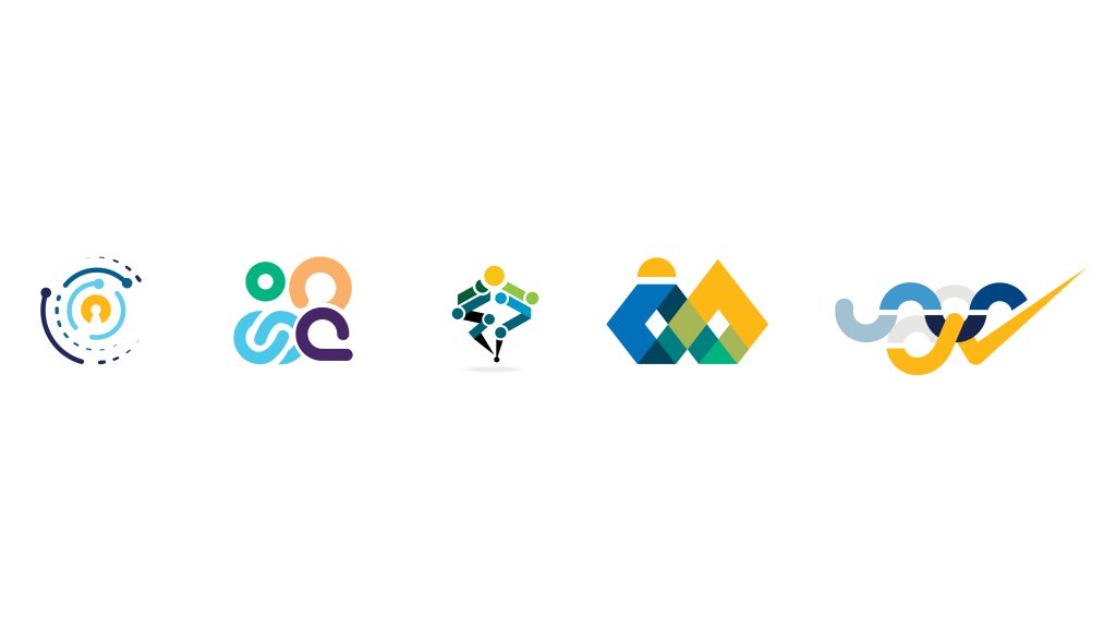
- Minimum of three initial custom designed logo icon options for board review
- Up to two rounds of design edits to the selected new brand direction
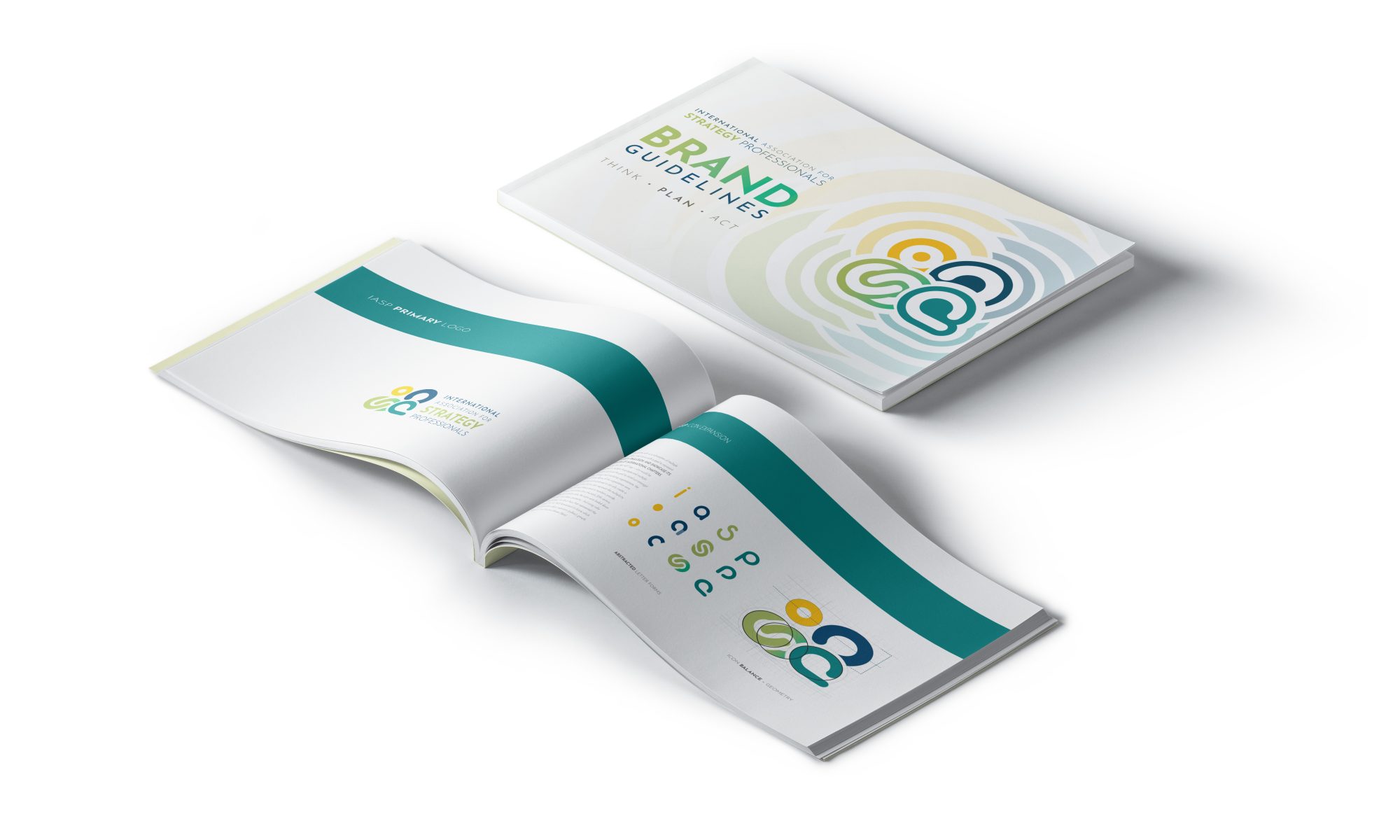
- Final logo icon, to be presented along with a coordinating “Brand Standard” document specifying proper use of the branded icon, typography, and color usage
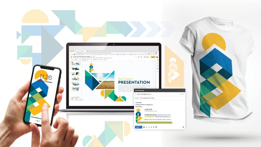
- Brand implementation through proper use of the icon, typography, and assigned colors in supporting marketing materials, including a PowerPoint Template, social media skins, and email signature
MOODBOARDS + ROUND 1 LOGO OPTIONS
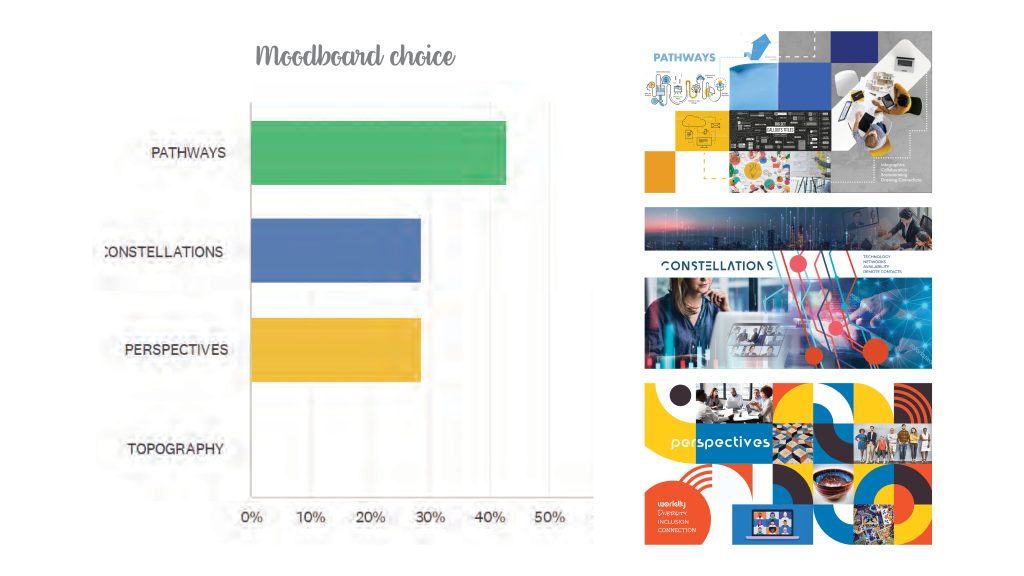
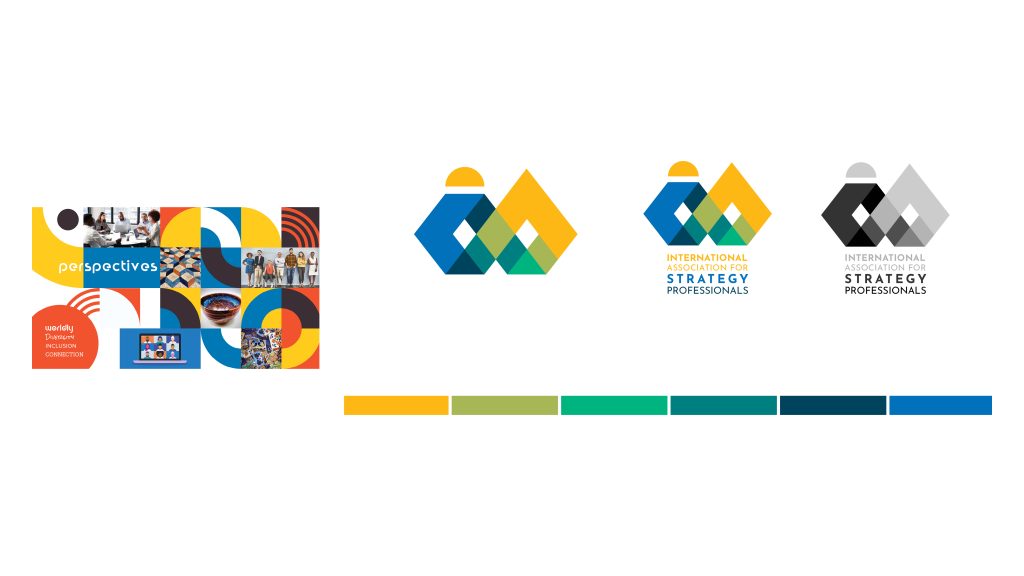
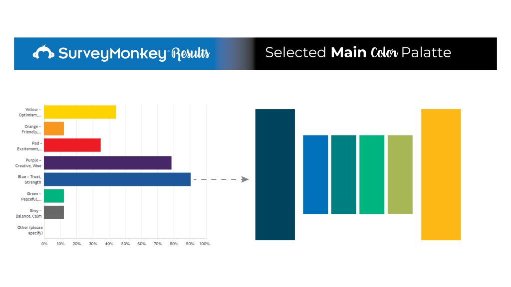
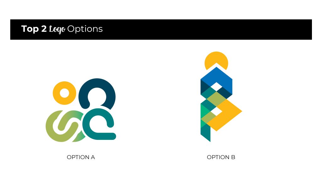
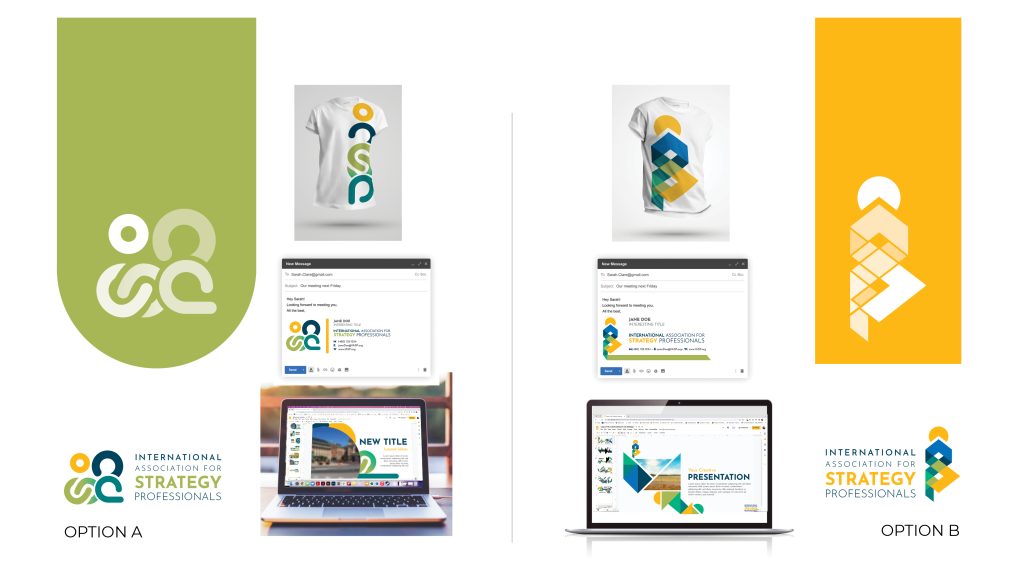
After initial presentation, I worked in tandem with the project manager and point of contact board member to create a Survey Monkey for all 16 board members to get their consensus on the presentation. This proved very helpful for next round options. There was a clear, binary vision of how to forward. Moodboards PATHWAYS and PERSPECTIVES moved forward and the top two options from the initial five were selected. Based on the feedback from both the meeting and the survey I honed these options into a second presentation.
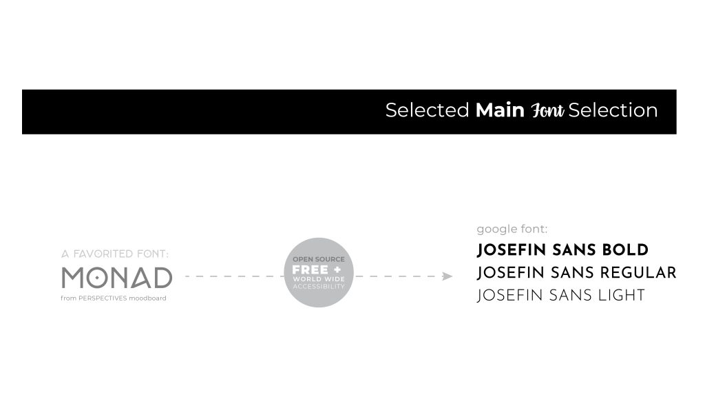
ROUND 2: TOP TWO moodboards and logo options
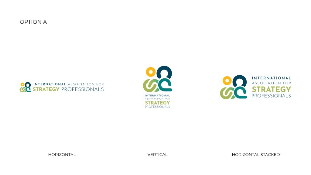
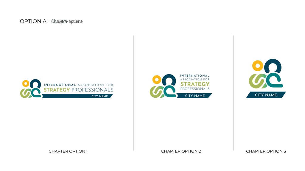
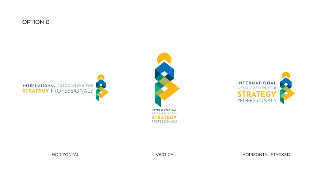
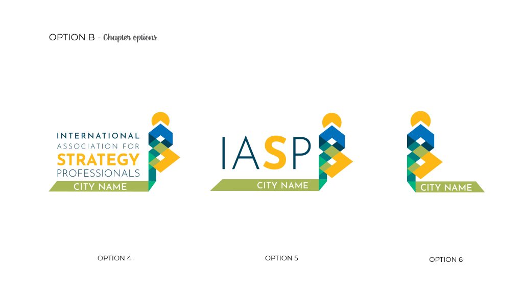
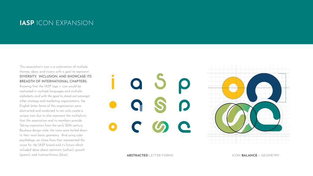
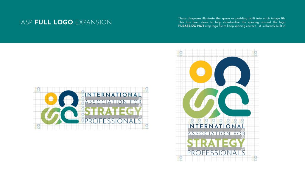
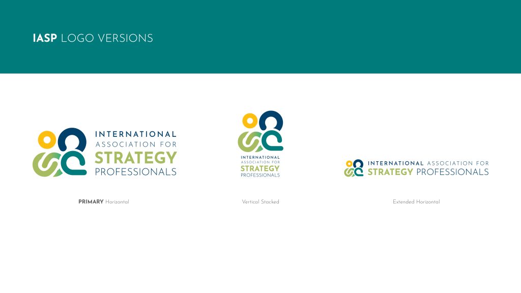
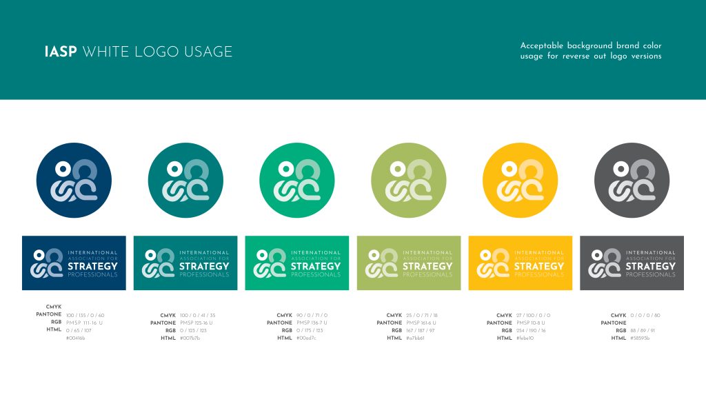
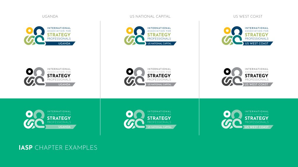
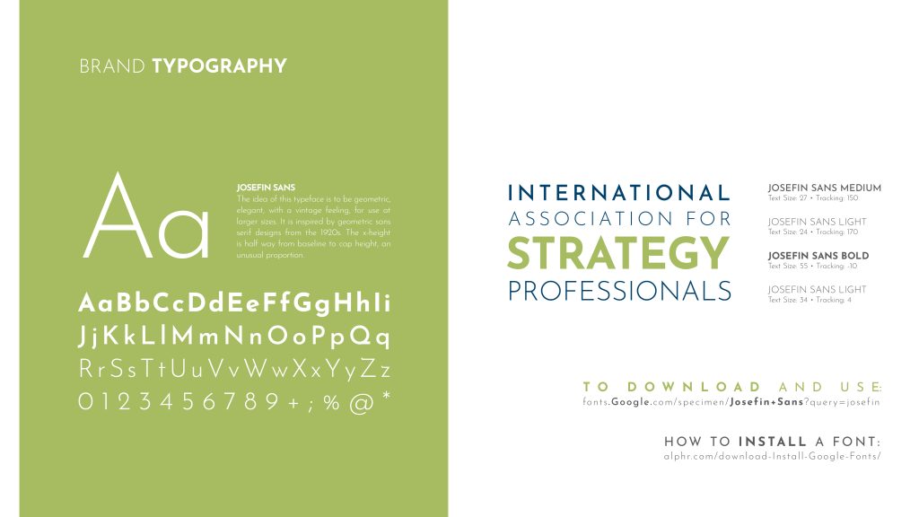
A final logo was selected by majority vote and I expanded the brand standard for the announcement of both the new name of the organization rebranding later that month at their annual convention. The primary branding fed the individual chapters logos which were based on the primary organization’s icon, along with its font and color usage.
FINAL LOGO + BRAND STANDARD
DESIGN DELIVERABLES
Identity Creation
Soup to nuts brand identity and standard, including icon, typography, image standards, and branded colors.
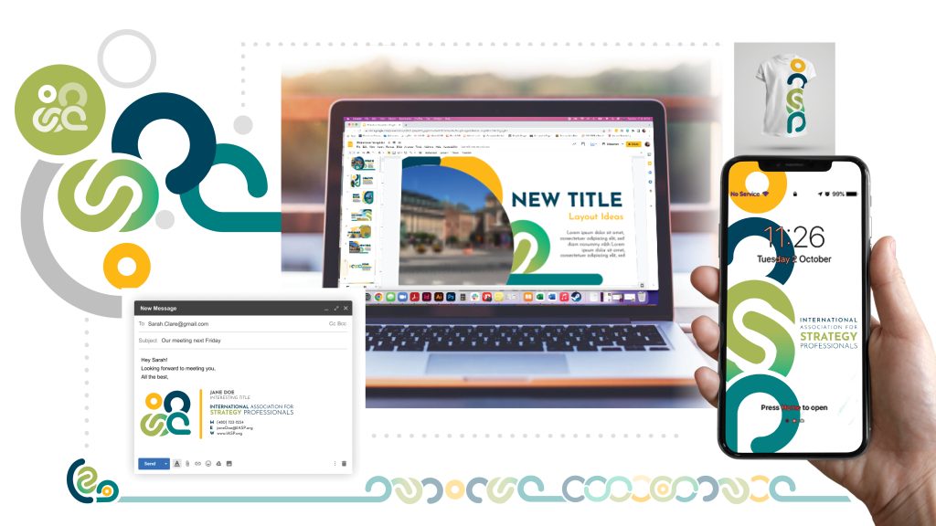
Social to Signage
Branded social, email signatures, and PowerPoint Templates were designed to help establish the the new branding across the organization
CLIENT TESTIMONIAL
I want you to know how thrilled the leadership of IASP is with the design of our new logo. When you first presented it to a small group to get buy-in, the response was a big WOW! Then when you presented it to the board, the affirmation was quite apparent. You have put us on a path to modernization of our identity and purpose. AND we are thrilled!
Thank you, thank you, thank you!
Susan S. Radwan
SMP, CAE, GSP
President of International Association of Strategy Professionals
