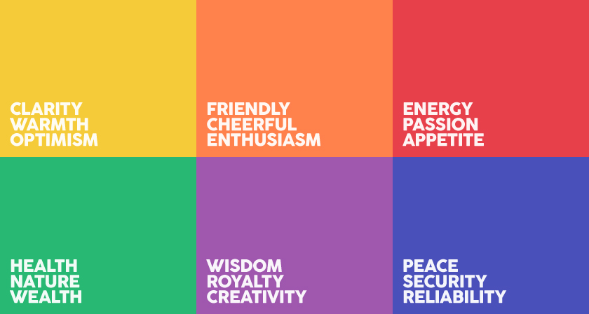
What sensation do we correlate with blue?
COOOOOOL? CALM?
ROYAL could describe blue…perhaps even purple.
While we often describe yellow as WARRRRMMM or GOLDEN.
But I coordinate yellow with flavors of citrus, curry, and saffron.
But this is my VISION. My flavors. My experience. Even my culture.
A few years ago, Entrepreneur published an article on the psychology of color and the misconceptions around color, branding, and color persuasion. It discussed how color interpretations can be flawed based on everyone’s individual upbringing. While color interpretation is absolutely dependent on personal experiences, there has been extensive research on how color can persuade and affect consumers in several ways.
But there is something universal about color that speaks to us. Something that the world, as a culture “reads.” Branded colors.
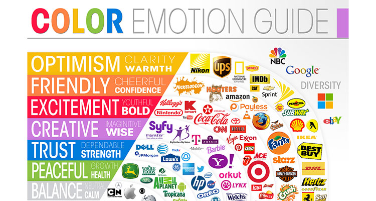
Every time a consumer interacts with a brand, an opportunity exists for that particular company to influence their audiences’ perceptions. It is up to the marketer to choose what designs and which colors will convince a consumer to make a purchase. By educating oneself on the psychology behind the color theory, creatives can further tap into branding techniques and better connect with their project, market, and/or clientele.
Up to 90% of a person’s assessment on products or services is based on colors alone as long as we perceive the brand color as one that fits a brand’s personality.
In other words, our likeness towards a brand can be greatly persuaded by color. One study entitled The Interactive Effects of Colors explains that the function of a product should be congruent to the color through which it is displayed; a product’s personality must be reflected in the brand’s colors. So as designers, when we chose colors for a layout or a logo, it’s important to consider “personality” we want to convey and how that color reinforces that message.
EXAMPLE:
What would be a TERRIBLE color scheme for a camping brand that focuses on being rugged and reliable?
Baby pink sparkles, perhaps?
Camping can often be about partial camouflage, about flowing nature, and needs products that will not showing all the dirt or the impacts of rugged wear and tear.
At least, for MOST camping brands. Not to say you can’t have a pink sparkles tent. I don’t want to yuck your tum, if you have the dream, I say get that pink sparkly tent if that is your vision! Live your best life!
But that would be for a specific person or client…or outlier…who wanted to perhaps “GLAMP” over “camp,” yes?
So that answers the question — WHO is this for? HOW are they using it? And what are visual broadcasters that speak directly to THAT client?
If you are starting a new project, it might make sense to drill down and tease out the ways the owners, the clients, and even yourself describe the product or business…
| CATEGORY | DESCRIPTION | RATING |
| SINCERITY | Domestic, honest, genuine, cheerful | 1-5 |
| EXCITEMENT | Daring, spirited, imaginative, up-to-date | 1-5 |
| COMPETENCE | Reliable, responsible, dependable, efficient | 1-5 |
| SOPHISTICATED | Glamorous, charming, romantic…(pretentious) | 1-5 |
| RUGGED | Tough, durable, sturdy, industrial | 1-5 |
By naming the category that the brand or product fits under, designers are able to craft a brand that makes the most sense and is the most appealing to their consumers….and in turn what colors that might be best associated with those feelings or descriptors.
COLOR + ACCESSIBLITY
Like mentioned before the are some biased or cultural lenses we see color through…our nation, our religion(s), our cultures…but there are also physical limitations too. Here are some things to just cross reference before you send your color palate into the world.
Psychological / Cultural association. Using the color blue for example again…many might have the association with blue to water or the sky. And culturally, blue is considered a masculine association in the US, whereas in China, it is considered a feminine color. Or another example might be white formal dresses. In the US comes off as bridal, while in Asian cultures white is for funerals. On the opposite side of the coin, red is customary for Chinese weddings, while black garb is traditional for American and European funerals. So consider what markets you intend to go into and do some research of what is appropriate in the industry, the region, and/or the culture you are about to work with.
Color blindness / Visibility Issues. An added, critical aspect that we consider when choosing the right color palette for a client’s brand is accessibility. When solving for accessibility — especially on the web — color can be a critical design choice. About 10% of men and 0.5% of women the population haves some form of color blindness, with red-green colorblindness being the most common.
Good color contrast is not just a good design choice, but can also improve visibility and readability. This helps not only those who deal with color blindness, but those with general visibility issues. The highest contrast and most legible is black elements on white backgrounds (WHO KNEW?!).
But we can’t make every brand black and white…SO use this website to cross reference your design’s contrast levels. HINT: I limit this contrast test to just the MAJOR elements of an ad or website…contact link, website information, major navigation or promo details.